Rib Rack
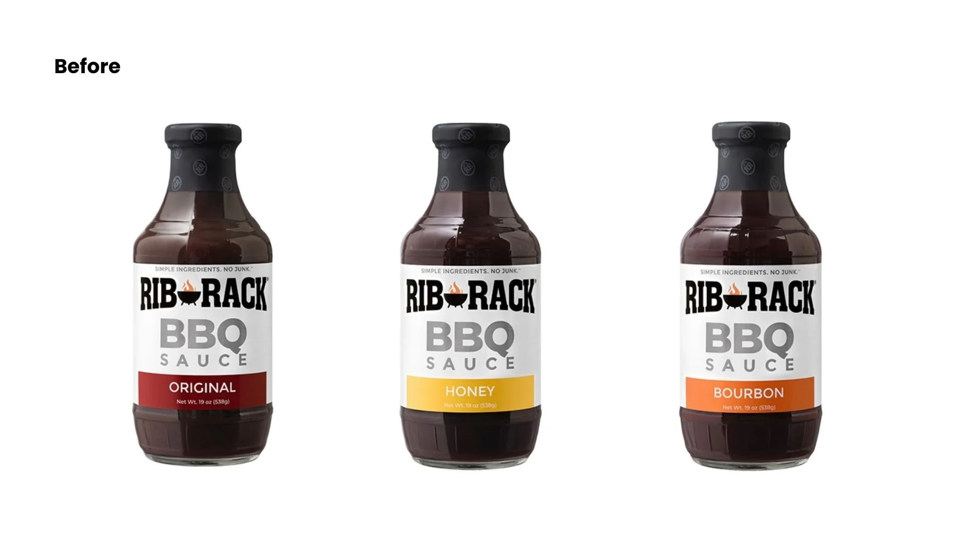
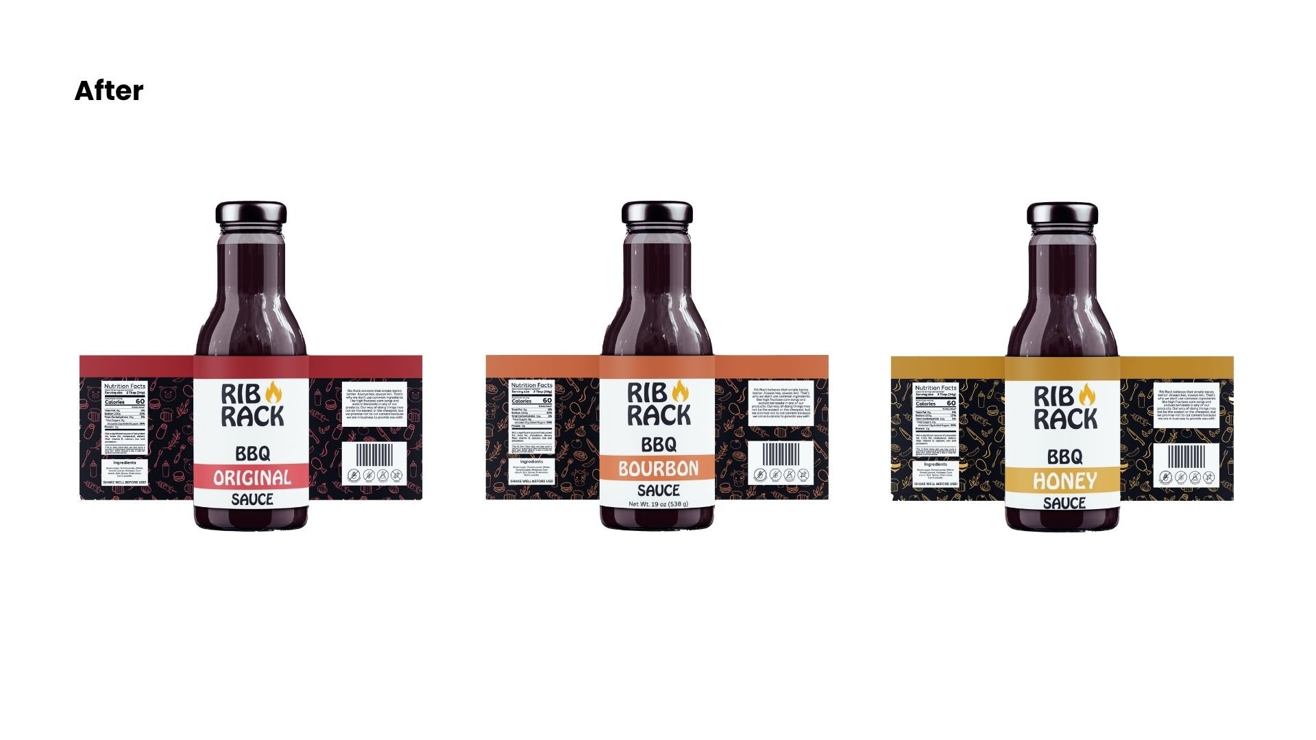
The goal was to rebrand and redesign the logo for Rib Rack to make it more appealing to their target audience. The strategy involved maintaining its traditional style while modernizing it to create a more natural and family-friendly aesthetic.
Tone: Traditional, Natural, Gathering, and Playful
Deliverables:
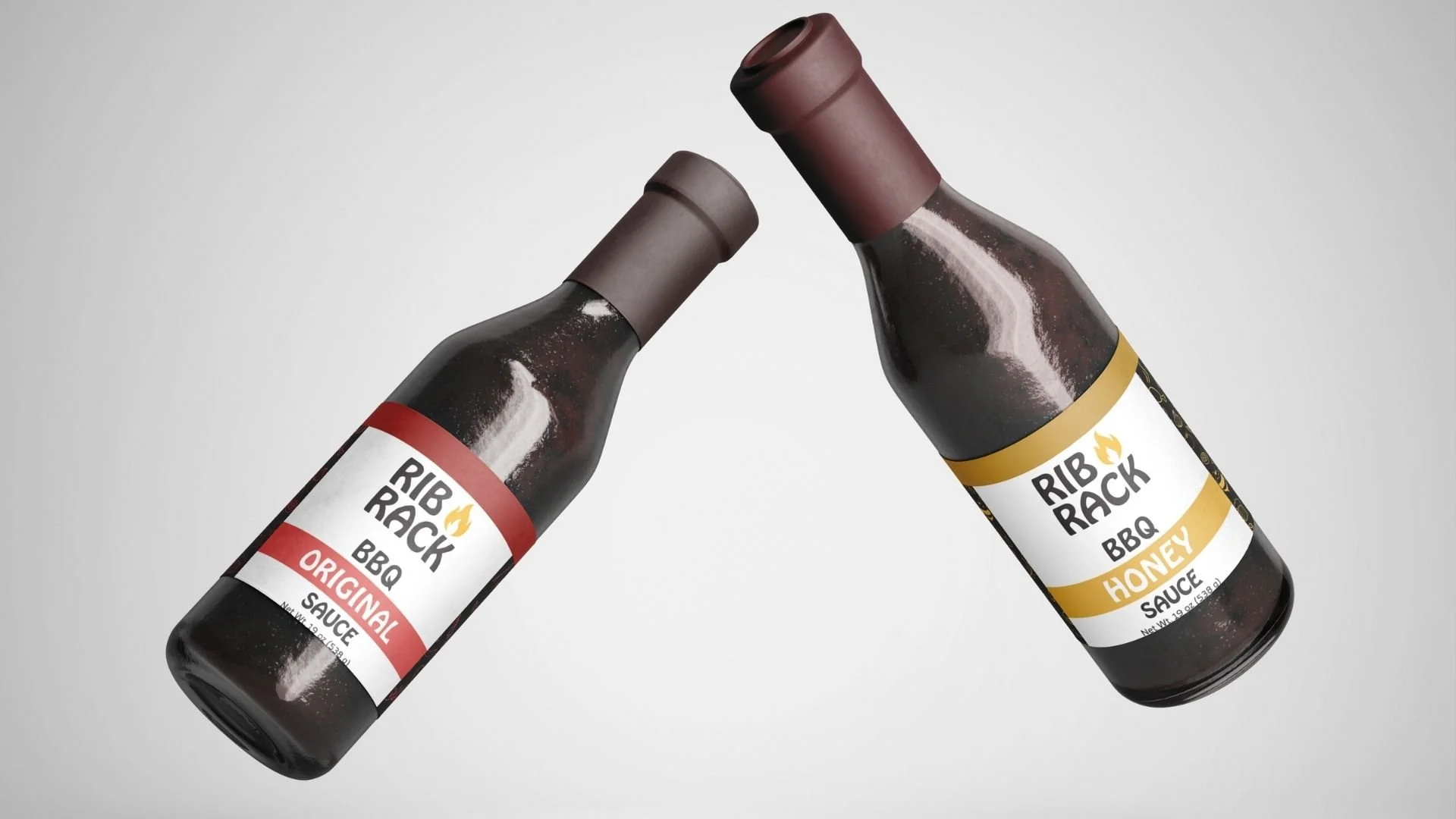
A new logo
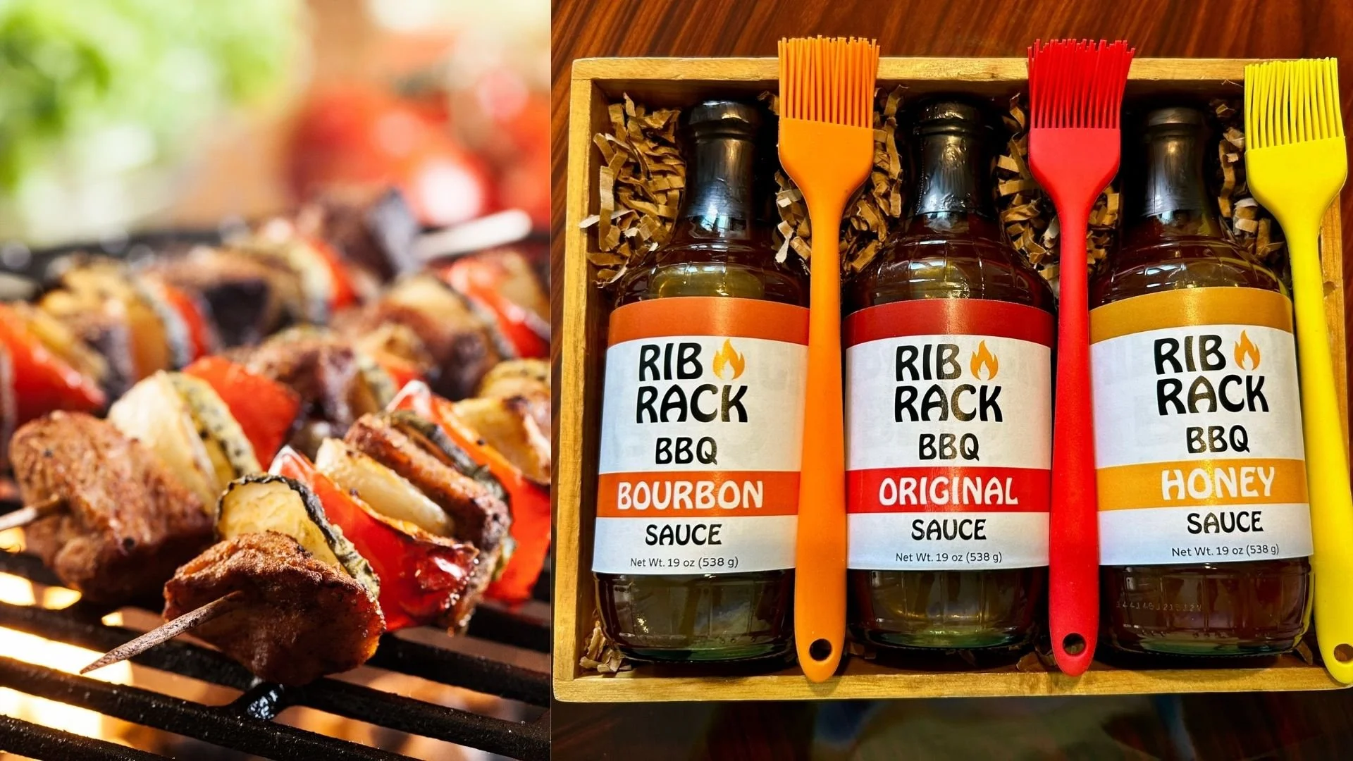
New labels
Packaging